For the Medical professionals including Physicians, Nurses and clinic/hospital administrators.
Electronic Medical Record (EMR) improves quality, safety and cost-efficiency. Through Electronic Medical Records Systems, physician and health practitioners can improve care coordination.
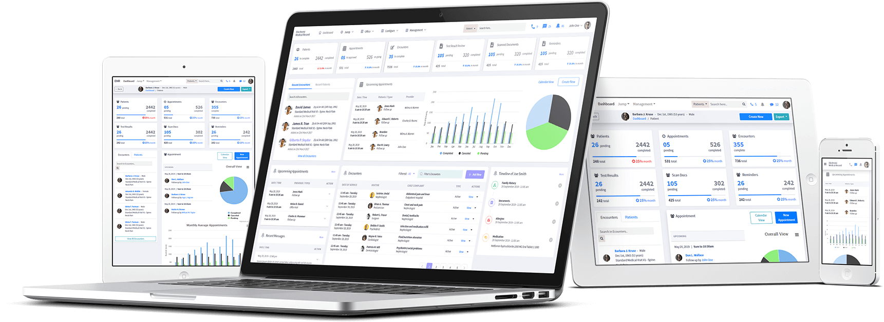
Developing a mobile and web app that helps practitioners in maintaining and updating the records fast and effectively and making EMR ‘on the go’ so that users can collaborate mobile devices with native and web responsive apps.
Design team was responsible for all the Desktop / Mobile experience. The Design Teams consisted of me and Ms. Rabia. During the whole process we took care to keep the best effective communication and consistency between the teams.
It was a health-care domain, so we also needed to research and figure out how patients & physicians perform their tasks. What are the main functional areas which are being used by them.
We worked as a team i,e, managers, developers and designers. We were continuously getting information and sharing our research with them to identify the main pain points and also find solutions for them.
We directly connected with the manager and developers. So when our manager had a great idea on healthcare domain they lectured us and explained the actual use of this EMR.
We found some of the Open-source EMRs for getting an idea about how they actually worked. We studied them to learn how they worked and familiarized ourself with the features and used the gained insights in our design process.
After trying some software, we found some issues that had to be resolved in our software:
Along with a consultancy, we conducted some research to identify our target audience. We did our best to make the user experience as non-technical as possible so that it’s quite easy to use for a new person.
After analyzing the research data we set out to work on the structure workflow.
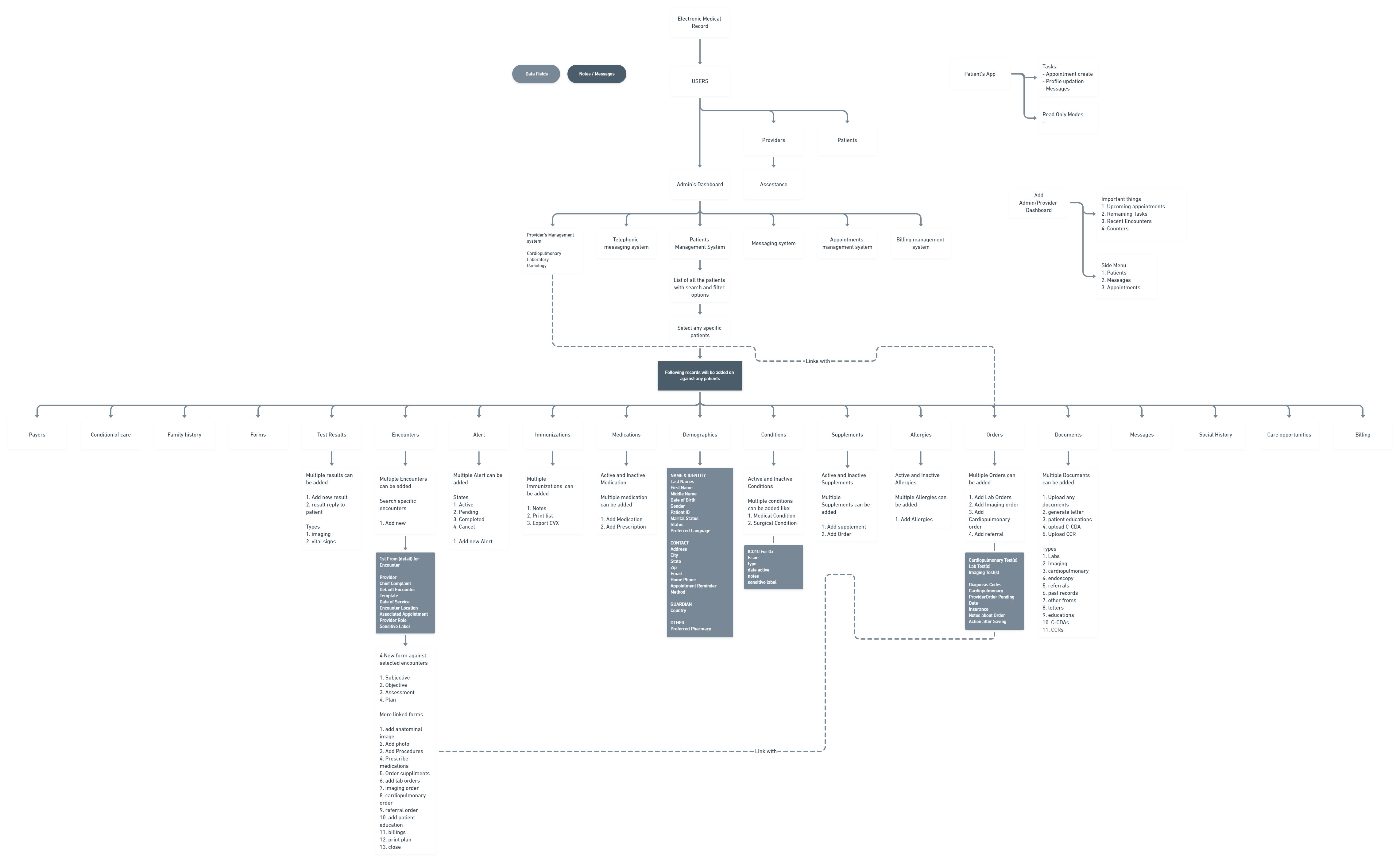
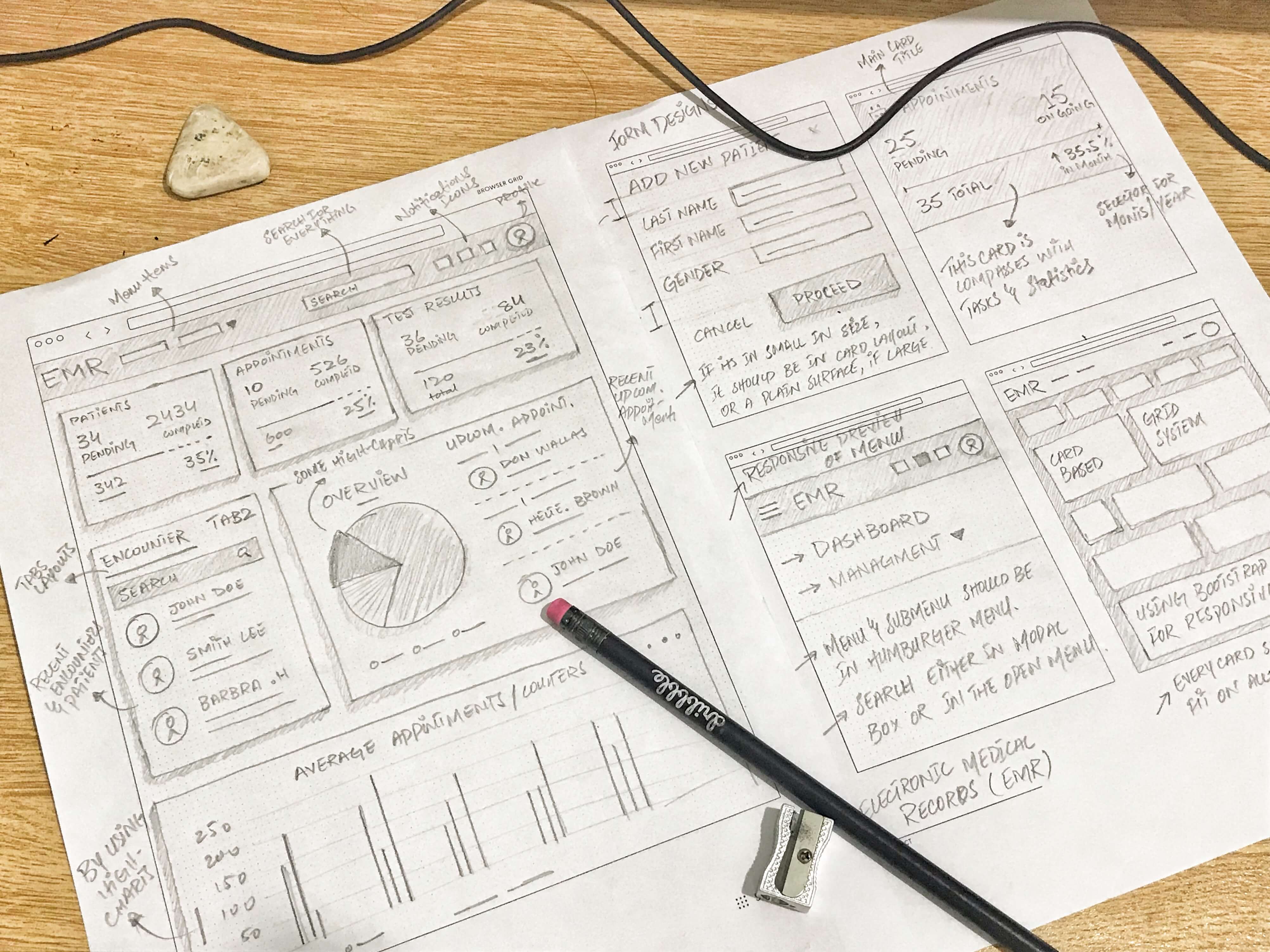
While research we are also considering the main layout of the system. After several brainstroming sessions we sketch some layouts to start making UI components.
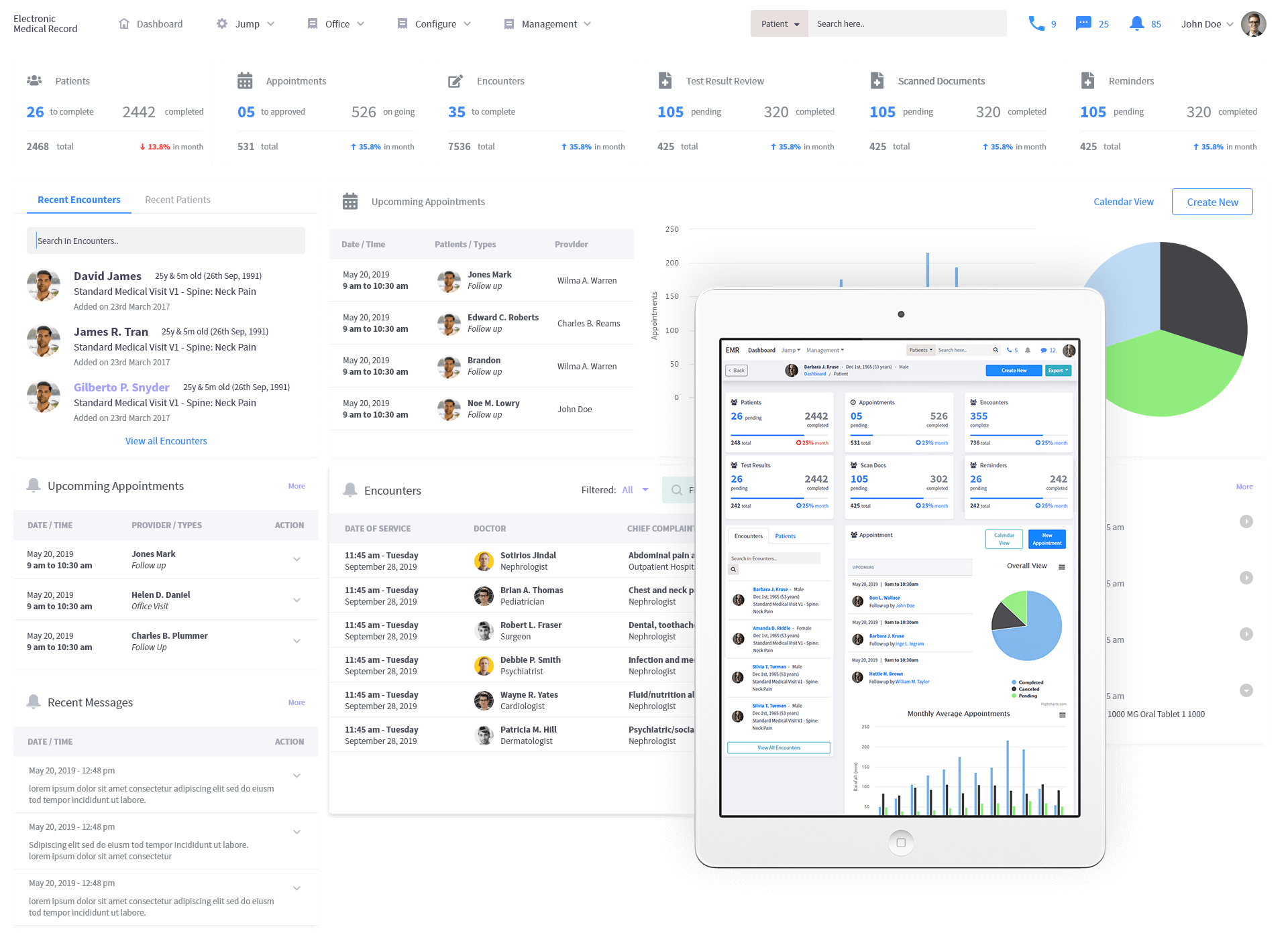
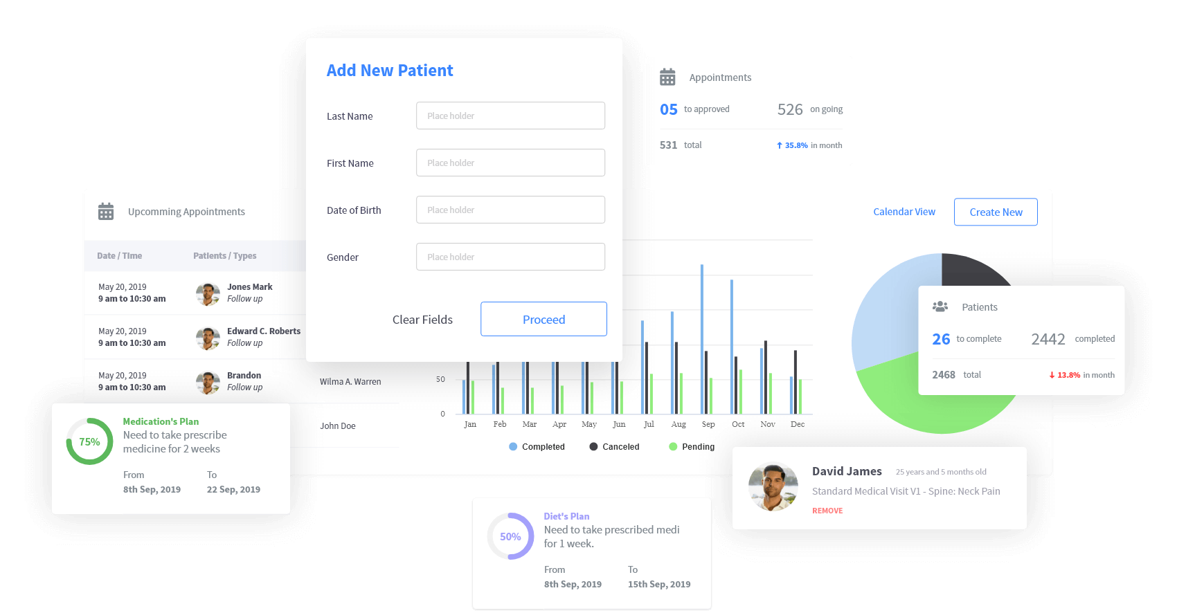
Every report should have a summary to get it to know quickly. Similarly, we designed our dashboard, in a way that will show the most important stats on first look. As you jump here, you would get all the updates at a single glance.
I converted simple stats into tasks, like you may observe the total count but you also get to know how much work you have pending.
One of the biggest part of a website design is the navigation - this is where the user will gain access to all of the website's content. It should be easy to use with clear directions to take the reader where they need to go. Because of this, it's not just the structure of the menu items that's important - it's the actual positioning, too.
Five years ago, most websites would have had a navigation that travelled down either the left or the right of the page, with the content flowing next to it. This is now considered an outdated practice, and most modern websites adopt a horizontal navigation which is displayed at the head of the site, normally above or below the logo area.
Having a horizontal navigation means you have more space to use for content beneath the header area.
If you have a standard website with your service overview and contact details, you may be best off with just a modern, horizontal navigation to best make use of your horizontal space.

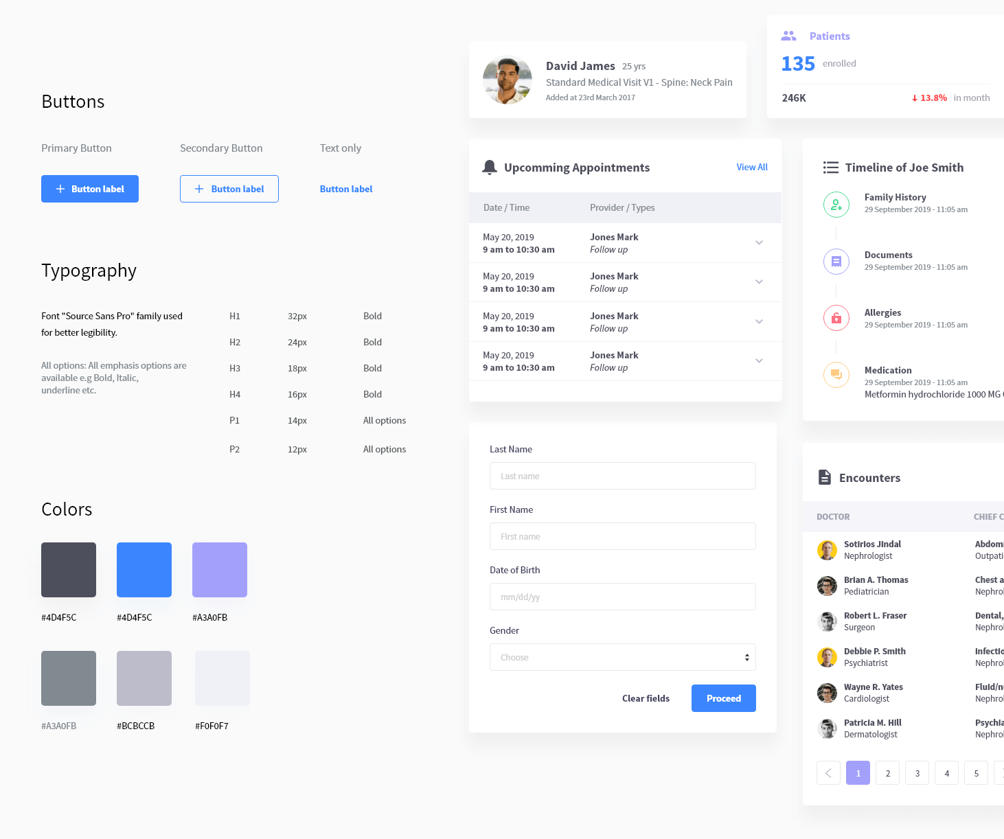
In order to achieve interface consistency, web and mobile design trends are moving toward the card-based UI design approach.
Cards are successfully used by the biggest companies, including Google, Instagram, Pinterest, and Facebook. Microsoft implemented a card-based design in their Windows operating system in 2006.
Cards usually have a similar structure on the page, which helps to organize content into chunks.
This enhances the scannability of content, helps to avoid long unreadable texts, and allows users to save time while getting the main information. It separates the different features from one another.
As people actively use multiple devices, from phones and tablets to laptops and desktop computers, it’s necessary to create a responsive design for all screens. It’s important for mobile and web pages to have the same content, as Google has started to prioritize mobile sites for indexing. Cards allow designers to build a unified aesthetic across devices and thereby create a consistent user experience.
Cards divide information into meaningful sections. These sections allow designers to prioritize content into comprehensive blocks of information. This is visually stimulating for both designers and users. The card structure saves a designer time on aligning elements within the card and makes content more readable and appealing for users. Minimalist interface design is one of the latest trends. Moreover, cards can increase content readability and highlight the delicacy of minimalism. Using cards in interfaces requires a perfect combination of visual design and usability.
As there are alot of navigation options, I decided to make a hamburger menu, so that we can use scroll option to adjust more menu items.
As patient have option for request an appointment schedule, I used a quick Fab button with create appointment item and with some simple steps patient could easily make any appointment.
With the feature of wellness program, patient can track down all their activities i.e diet and medications. With some simple interactive interactions patient could easily perform and update their tasks.
.png)
.png)
.png)
.png)
.png)
.png)
.png)
.png)
.png)
.png)
.png)
.png)
We all have our preferred working and communicating methods, but if the client wants to introduce something else, don’t say no right away. Start using it, test it, see if it works. You never know, you might end up with a method you’ll love later on.
Implementing new tools during a live project can overwhelm, but you don’t always have the time to try them out beforehand. If you have an linkling that another tool might work better, use it and avoid the infinite loop of “coulda-shoulda-woulda”sss.
Create a user journey and identify points to introduce little delights (illustrations, feedback screens). Forming a personality for a product is not only fun, but it will engage your users in a whole different way.
